Manya Singh
Seattle, WA
Accenture: Data Marketplace
Generative AI powered enterprise Data management tool
Overview
ORGANIZATION
Accenture Song
ROLE
User Experience Designer
Duration
1 Year ≈ (April 2023 - April 2024)
Team
2 User Experience Designers + 1 Senior UX Researcher + 1 Design Manager + 1 Design Director
my Tasks
Wireframing, Information Architecture, Design System, Dashboards, Heuristic Evaluations, Accessbility Audit, Usability Testing, Research
*Disclaimer: Due to NDA restrictions, the visuals from my work at Accenture are limited and masked. Feel free to reach out for more details.
Key Impact
70%
Reduction in time spent accessing data of a business intelligence platform I redesigned
25%
Higher user satisfaction (CSAT survey)
My Role
As the UX Designer, I collaborated with researchers, developers, product owners, and fellow designers on the end-to-end redesign of a generative AI-powered enterprise data platform. Alongside broader platform improvements, I took ownership of key flows such as the wizard experience, notification center, and several design system components, driving clarity, accessibility, and consistency across the product.
Outcome
Data Marketplace: AI-Powered Business Intelligence tool for Enterprise Data
Drag the center icon to see the before and after versions!
What I designed

1000+ components for (light + dark mode)
Chat Interface
250+ Frames Redesigned
15+ Forms and Wizards
Data Viz Dashboards
Accessibility Audit of 1000+ screens
Users
5k Daily Users
50K Monthly Users
15 Countries
Glossary
Some terms that might help understand the case study

Accenture Song:
World’s largest tech-powered creative group driving growth through design and innovation.

Data and AI Studio:
Global team using generative AI to build smart, scalable data products for enterprise transformation.

Enterprise Data Management Tool:
A centralized platform for organizing, governing, and ensuring the quality of enterprise data.

Data Marketplace:
An AI-powered BI tool and one-stop data hub that delivers actionable insights to executives.
Understanding The Users

Data Producer: Owns and manages data products, ensures timely updates, and maintains data documentation. Responsible for publishing clean, reliable data for others to use.

Data Consumer: Uses data to generate insights or make decisions. Access varies by role—some have direct access, while others must request it depending on their permissions or seniority.

Data Governor: Ensures data quality, compliance, and integrity across the organization. Defines policies, oversees access controls, and maintains trust in the data ecosystem.
Understanding the Foundation Through MVP

Understanding the Foundation: To inform the redesign, it was essential to first immerse in the existing system. Contributing to the MVP offered valuable insights into the platform’s structure, user flows, and evolving data needs.

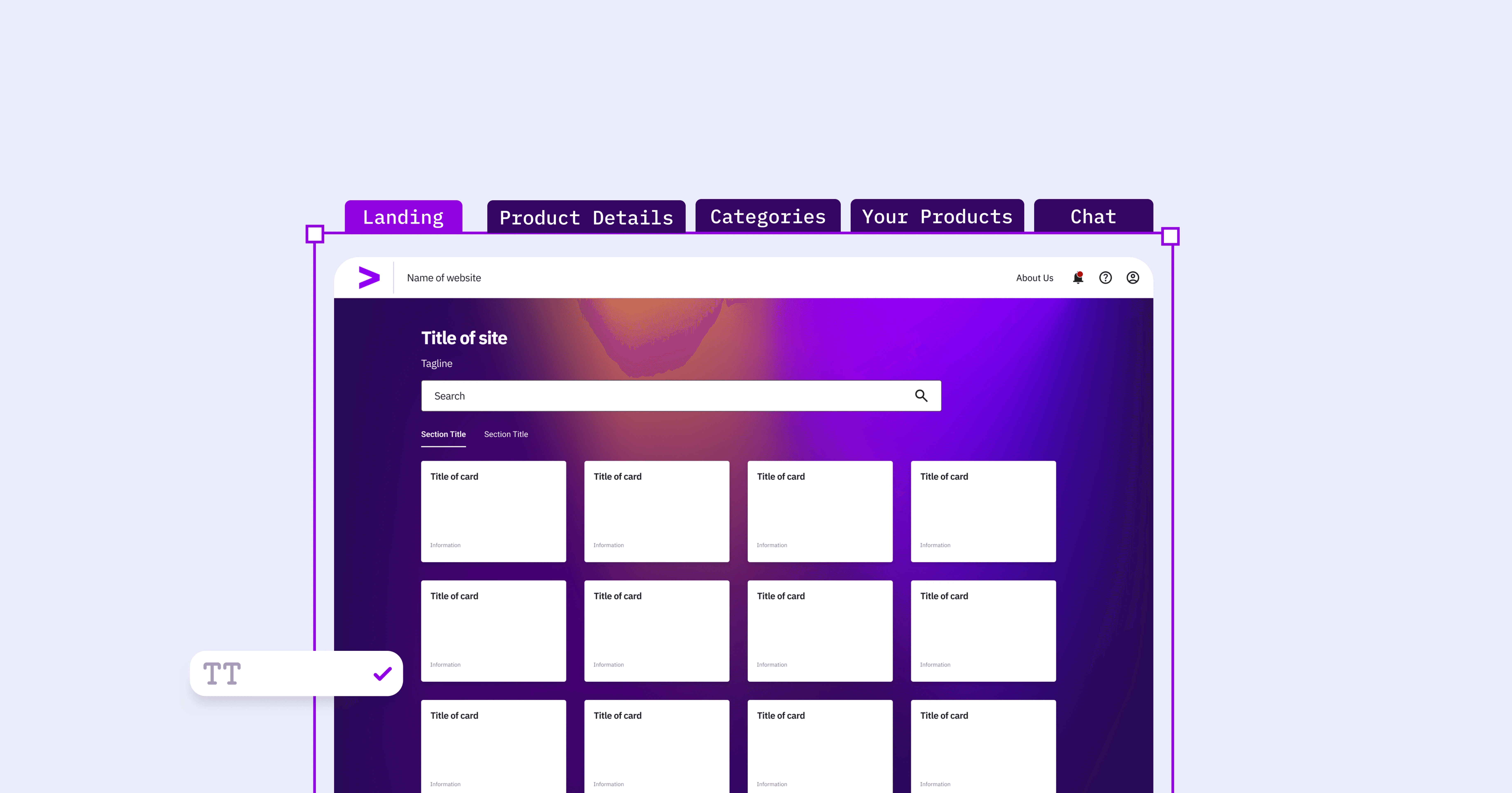
Leading UI Design: As the sole UX designer on the MVP, I managed the design of key user experiences—including the landing page, product details view, and categories page. These touchpoints formed the core of how users interacted with over 8K data assets.
Introducing 0→1 Features: Several new features were designed and implemented to improve usability and engagement early on. This included a chat interface for live support and a bookmarking feature to help users quickly access relevant data assets.
Why start with foundation?
Before diving into screens, I immersed myself in the platform’s actual usage patterns. Understanding the distinct roles of data governors, producers, and consumers helped me design with empathy and purpose, ensuring each touchpoint supported specific user goals.
Planning and conducting research

Heuristic Evaluation: To assess the existing experience, an evaluation was conducted by me across 25+ wireframes. This helped identify early usability issues, visual inconsistencies, and areas of friction in key workflows.

Usability Testing & Stakeholder Interviews: We interviewed 20+ stakeholders and conducted usability tests with over 30+ users. This revealed major challenges such as information overload, inefficient workflows, and unclear navigation.

Collaborative Analysis: Worked closely with the broader team to analyze usability findings and synthesize insights. This collective effort ensured alignment on core problems and shaped the priorities for redesign.
Measure What Matters
In a multi-stakeholder, high-stakes environment, it was crucial to tie UX changes to real metrics. By conducting usability tests, heuristic evaluations, and CSAT analysis, we could prioritize solutions that reduced friction and moved business KPIs. This helped build trust with leadership and shifted the conversation from “what looks better” to “what performs better.”
Turning Insights into Action
What insight drove this?
Users struggled with information overload and unclear data hierarchy.
Navigation was inefficient, with too many steps to reach key data.
Search lacked relevance due to no personalization or filtering.
Access status was unclear, slowing decision-making.
Inconsistent UI elements caused confusion across screens.
First-time users didn’t know where to start or what to do.
Impact Effort Matrix

To align the redesign with both user needs and business priorities, we created an Impact-Effort Matrix. This ensured that the team, including leadership, product, and engineering, had a shared roadmap for improving the platform's usability and efficiency.
Re-design of Marketplace
As part of the redesign, several high-impact features and systems were ideated, prototyped, and implemented to improve accessibility, efficiency, and adoption across the platform. These additions addressed both user and business needs in a data-heavy, multi-persona environment. Below are some showstopper features.
Core Experience Re-Design
Generative AI-Powered Personalization
Design System
A Systems Approach
The redesign was guided by a systems-thinking mindset. It focused on how people, data, and workflows connect across the platform. Instead of isolated screens, the team prioritized scalable patterns, accessible interactions, and modular design choices that could adapt to evolving needs and ensure long-term consistency across the product.
Core Experience Re-Design
Product Details Card


Why It Was Needed
The original card layout included elements that didn’t support decision-making, such as irrelevant icons, unused review stars, and inconsistent CTA colors. Key information like access status was missing, and the design created visual clutter, making it harder for users to quickly scan and act.
What I Designed
As part of the core user experience redesign, the card was restructured to prioritize clarity and utility. Unnecessary elements were removed, the CTA color was standardized to purple, and space was optimized by limiting title length. New features like access status, bookmarks, and notifications were introduced to support personalization and improve user efficiency.
Gen AI-Powered Personalization
Search and Role-Based Access

Why It Was Needed
With diverse user roles and vast data sets, users often struggled to find relevant information quickly. Existing search and navigation workflows lacked personalization and did not support role-specific access, impacting efficiency and discoverability.
What I Designed
Designed and iterated AI-powered features like smart search and role-based access control (RBAC) to streamline discovery for data governors, producers, and consumers. For the future state, I conceptualized a generative AI-powered search interface that interprets natural language queries and visualizes large datasets.
Design System
Standardizing the system

Why It Was Needed
Teams across the Data & AI Studio were using inconsistent design systems, leading to fragmented UI, accessibility issues, and inefficient handoffs. An audit revealed problems like misaligned padding, color mismatches, and complex variants.
What I Designed
Collaborated with global teams to create a unified, responsive design system that supported diverse product needs while ensuring accessibility and consistency. This became the foundation for the Accenture Design System Playbook.
Components included: Colors, Typography, Icons, Accordions, Buttons, Filters, Cards, Tables, Alerts, KPIs, Navigation, Charts.
Takeaway
Less is More – in enterprise UX, the real challenge isn't designing new components, but ruthlessly simplifying existing ones. While stakeholders will always demand new features, our real value comes from designing less: removing the unnecessary, consolidating the redundant, and fighting for only what truly matters to users.
Cross-functional collaboration was key – Aligning designers, developers, and stakeholders ensured solutions were both usable and scalable.
Stakeholders speak different languages – Learned to translate UX findings into business metrics that resonated with different leaderships.
Other projects at accenture
Data Visualization: Dashboards for Enterprise Data

Designed Power BI dashboards to help leadership track data governance across platforms. Addressed challenges like data volume, Power BI constraints, and poor discoverability. Created core UI components and introduced real-time notifications for governance alerts. Worked with stakeholders to restructure categories and improve data flow.
Accessibility Audit: Enhancing Accessibility of PowerBI dashboard for C-Suites

Conducted an accessibility audit of a PowerBI dashboard used by C-suite executives, identifying issues that deviated from WCAG AA standards. Recommended fixes like improving contrast, adding clearer outlines, enhancing visual hierarchy, and introducing screen reader-friendly labels. Pitched prioritized changes to product owners, aligning stakeholders on feasible, high-impact improvements.
Hear From My Team

Want To Know More?
Get in touch to know more details.